Analytics
The Analytics dashboard provides deep insights into your activity patterns and application usage over multiple time periods.
Time Period Views
Switch between different time ranges using the tabs:
Day View
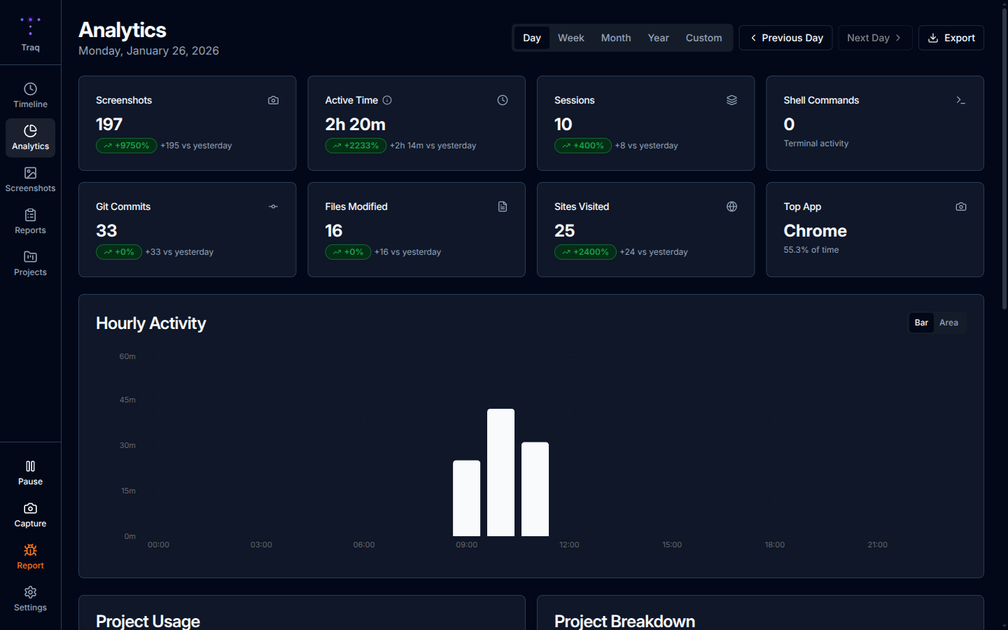
- Stats Grid - Active time, sessions, screenshots, comparison with previous day
- Hourly Activity Chart - Bar chart showing activity by hour
- App Usage Donut Chart - Visual breakdown of time by application
- App Usage Table - Detailed list with click-through to filtered timeline
Week View
- 7-day summary with daily breakdowns
- Comparison metrics vs. previous week
- Trend indicators showing productivity changes
Month View
- Calendar heatmap showing daily activity intensity
- Monthly totals and averages
- Day-by-day breakdown with click navigation
Year View
- Month-by-month summary
- Yearly productivity trends
- Click any month to drill down
Custom Range
- Select any date range for analysis
- Great for project retrospectives or billing periods
Daily Statistics
The stats grid shows key metrics with comparison indicators:
- Total Active Time - Hours spent at your computer
- Sessions - Number of work sessions
- Screenshots - Total captures for the day
- Change Indicators - Up/down arrows showing comparison with previous period
Application Usage
Donut Chart
Visual breakdown of time spent by application:
- Hover over segments for exact durations
- Center shows total tracked time
- Color-coded by application
Usage Table
Sortable, searchable list showing:
- Application name with icon
- Time spent
- Percentage of total time
- Click any row to see that app's activity in timeline
Activity Patterns
Hourly Distribution Chart
Bar chart showing activity by hour:
- Identify your peak productivity hours
- See quiet periods and breaks
- Useful for optimizing your schedule
Export Options
Export your analytics data in multiple formats:
- CSV - For spreadsheets and data analysis
- HTML - For sharing or archiving
- JSON - For integration with other tools